Looking to supercharge your Tailwind CSS development? Here's a quick rundown of the top 10 component libraries for 2024:
- Tailwind Elements: 500+ components, free
- Flowbite: 400+ components, free and paid versions
- Tailwind UI: Official library, 500+ components
- Tailblocks: 63 free components
- Tailgrids: 600+ components and templates
- Preline UI: 250+ open-source components
- Ripple UI: Pre-built elements with regular updates
- Sira: 24 components with accessibility focus
- Mamba UI: 157 components across 41 categories
- Kutty: 66 pre-built UI sections
Related video from YouTube
Quick Comparison
| Library | Components | Best For | Framework Support | Dark Mode |
|---|---|---|---|---|
| Tailwind Elements | 500+ | Complex projects | Multiple | Yes |
| Flowbite | 400+ | Versatile use | Multiple | Yes |
| Tailwind UI | 500+ | Professional projects | Any Tailwind-compatible | N/A |
| Tailblocks | 60+ | Quick prototypes | Any Tailwind-compatible | N/A |
| Tailgrids | 600+ | E-commerce, marketing | HTML, React, Vue | N/A |
| Preline UI | 250+ | Modern interfaces | React, Next.js, Svelte, Remix | Yes |
| Ripple UI | 36 | Simple to intermediate | Multiple | Yes |
| Sira | 24 | Custom, modern interfaces | React, Vue | Yes |
| Mamba UI | 150+ | Modern look and feel | Multiple | Yes |
| Kutty | 66 | Standard components | Any Tailwind-compatible | No |
Each library has its strengths. Consider your project needs, framework, and customization requirements when choosing. Let's dive into the details of each to help you pick the best fit for your next project.
Tailwind Elements: A Free UI Kit for Tailwind CSS
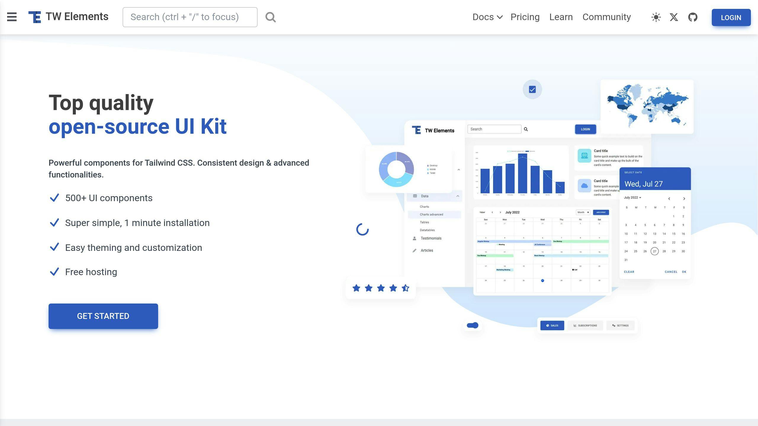
Tailwind Elements is an open-source UI kit that works with Tailwind CSS. It's packed with over 500 components, templates, and plugins to speed up your web development.
What's Inside?
Tailwind Elements offers:
- Forms, cards, buttons, and navigation elements
- A design system called "Material Minimal"
- Dark mode support
- Customizable color palette
- Component class customization
Here's how you can customize an input component:
<div class="relative mb-3 xl:w-96" data-twe-input-wrapper-init data-twe-class-notch-leading-normal="border-red-500 dark:border-red-500">
    <input type="text" class="peer block min-h-[auto] w-full rounded border-0 bg-transparent px-3 py-[0.32rem] leading-[1.6] outline-none transition-all duration-200 ease-linear focus:placeholder:opacity-100 peer-focus:text-primary" id="exampleInput" placeholder="Custom Input" />
    <label for="exampleInput" class="pointer-events-none absolute left-3 top-0 mb-0 max-w-[90%] origin-[0_0] truncate pt-[0.37rem] leading-[1.6] text-neutral-500 transition-all duration-200 ease-out peer-focus:-translate-y-[0.9rem] peer-focus:scale-[0.8] peer-focus:text-primary">Custom Input</label>
</div>
Documentation and Support
Tailwind Elements provides:
- Detailed API info
- Class customization tables
- Step-by-step tutorials
The project encourages community involvement for growth and support.
Compatibility and Hosting
Tailwind Elements works with popular frameworks and offers free hosting through MDB GO. You can publish projects with a single command.
By the Numbers
As of 2024, Tailwind Elements has:
- 14 weekly downloads
- 5 GitHub stars
- 0 reported issues
While these numbers are modest, Tailwind Elements is still a solid choice for developers seeking a free, customizable component library for Tailwind CSS.
2. Flowbite
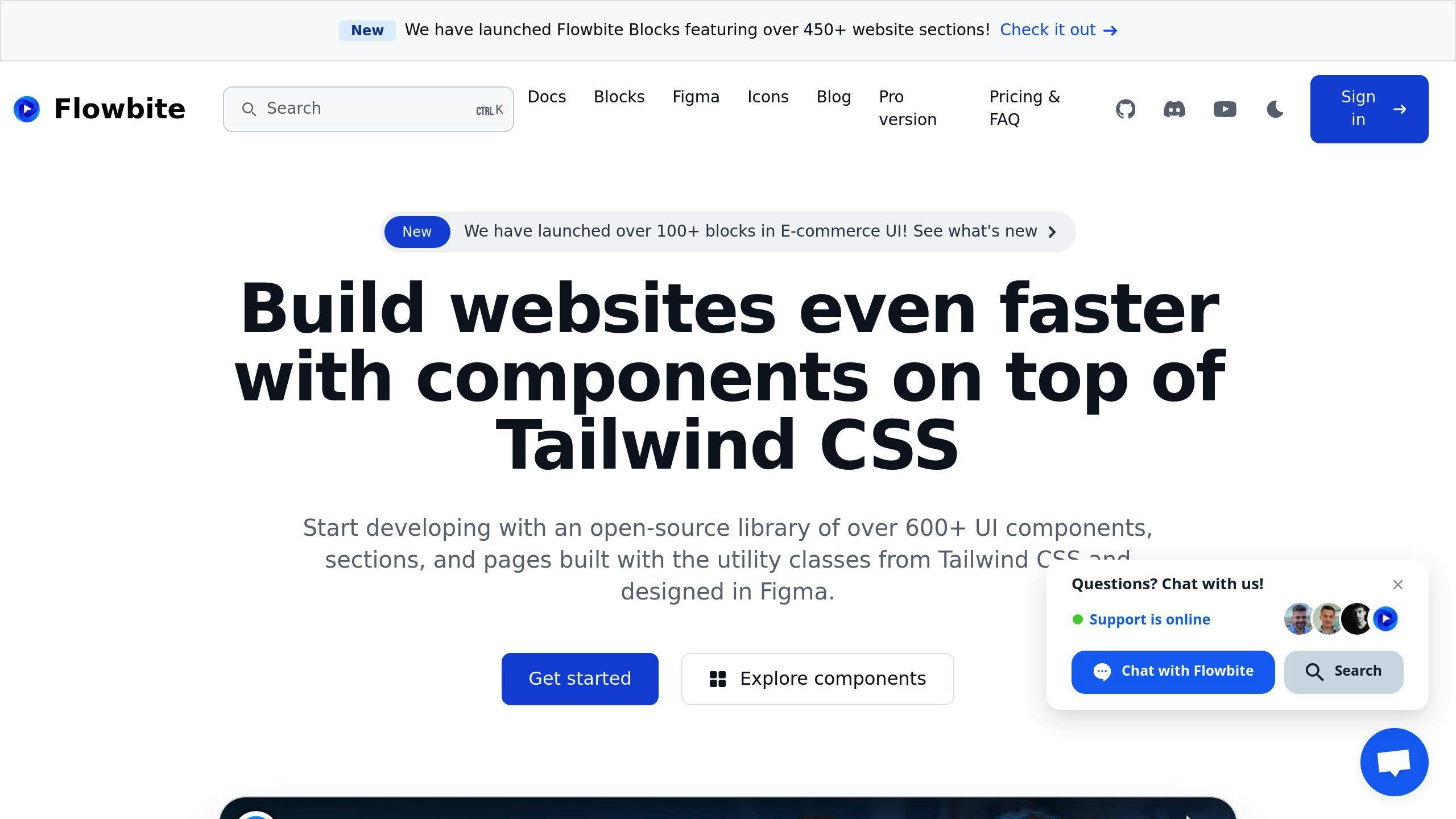
Flowbite is a Tailwind CSS plugin that adds 600+ UI components, sections, and pages to your toolkit. It works with Tailwind's utility classes, making it a popular choice for developers.
Components
Flowbite offers components like:
- Buttons
- Forms
- Navigation bars
- Dropdowns
- Modals
- Cards
These are built with Tailwind CSS classes, so you can easily customize them.
Customization
Want to tailor Flowbite? Just edit the tailwind.config.js file:
- Set your colors and fonts in
theme - Define hover and focus states in
variants - Add Flowbite as a plugin
Here's how to add Flowbite:
// tailwind.config.js
module.exports = {
  // ...other config
  plugins: [
    require('flowbite/plugin')
  ]
}
Documentation
Flowbite's docs cover:
- How to install
- Using components
- API details
- Customizing classes
User Support
As of 2024, Flowbite offers:
- Free version: 67+ UI components
- Pro version: 600+ components, 450+ website sections
- Dark mode and RTL support
| Feature | Free | Pro |
|---|---|---|
| UI Components | 67+ | 600+ |
| Website Sections | Limited | 450+ |
| Figma Assets | No | Yes |
| App UI Templates | No | 21+ |
Flowbite is a "copy and paste library" - quick to implement, but remember to change class to className for React.
"Flowbite provides a robust set of design tokens and components based on the popular Tailwind CSS framework. From the most used UI components like forms and navigation bars to the whole app screens designed both for desktop and mobile, this UI kit provides a solid foundation for any project." - Eugene Fedorenko, Lead designer at Wildbit
Flowbite's Tailwind integration and utility-first design make it a strong player in component libraries.
3. Tailwind UI
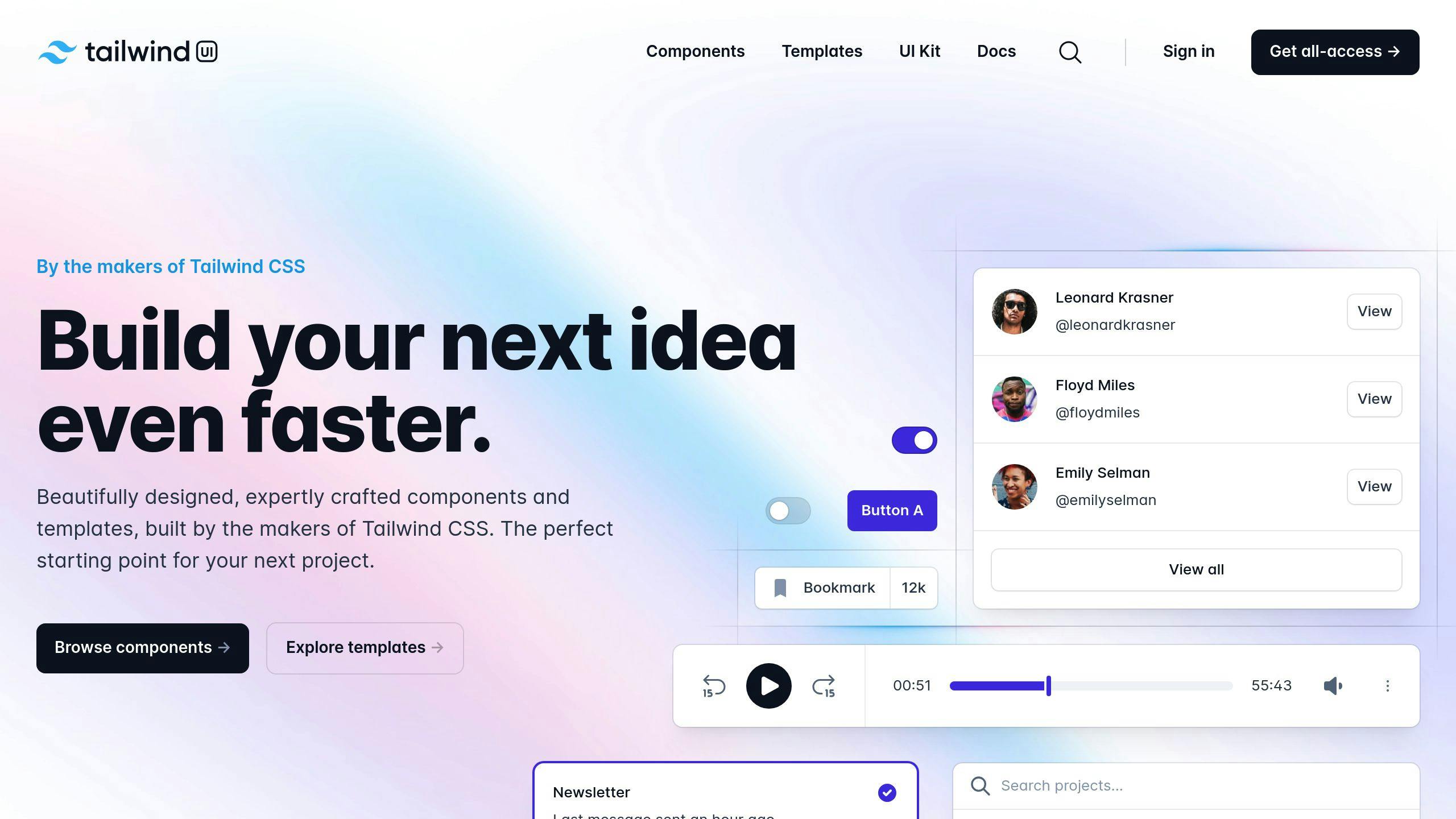
Tailwind UI is the official component library from the Tailwind CSS team. It's packed with pre-built components and templates to speed up your development.
Components
Tailwind UI offers 500+ responsive components in three main categories:
- Application UI
- Marketing
- E-commerce
You'll find everything from form layouts and tables to heroes and checkout forms.
Customization
Built with Tailwind CSS classes, these components are super flexible. You can:
- Tweak utility classes
- Add dark mode
- Adjust colors and typography
Just remember: some interactive bits need JavaScript to work properly.
Documentation
Tailwind UI comes with solid docs:
- How to install
- Using with different frameworks (HTML, React, Vue, Next.js)
- Tips for customization
It's also a great way to see how the pros build real sites with Tailwind CSS.
User Support
Two license options are available:
| License | Price | For |
|---|---|---|
| Personal | $299 | Individual use |
| Team | $799 | Up to 25 team members |
Both give you:
- All components and templates
- Unlimited end products
- Freedom to modify components
But you can't:
- Redistribute components separately
- Create competing UI libraries
"Tailwind UI provides a robust set of design tokens and components based on the popular Tailwind CSS framework. From the most used UI components like forms and navigation bars to the whole app screens designed both for desktop and mobile, this UI kit provides a solid foundation for any project." - Eugene Fedorenko, Lead designer at Wildbit
Tailwind UI isn't cheap, but many devs find its pro design and customization options worth the price tag.
4. Tailblocks
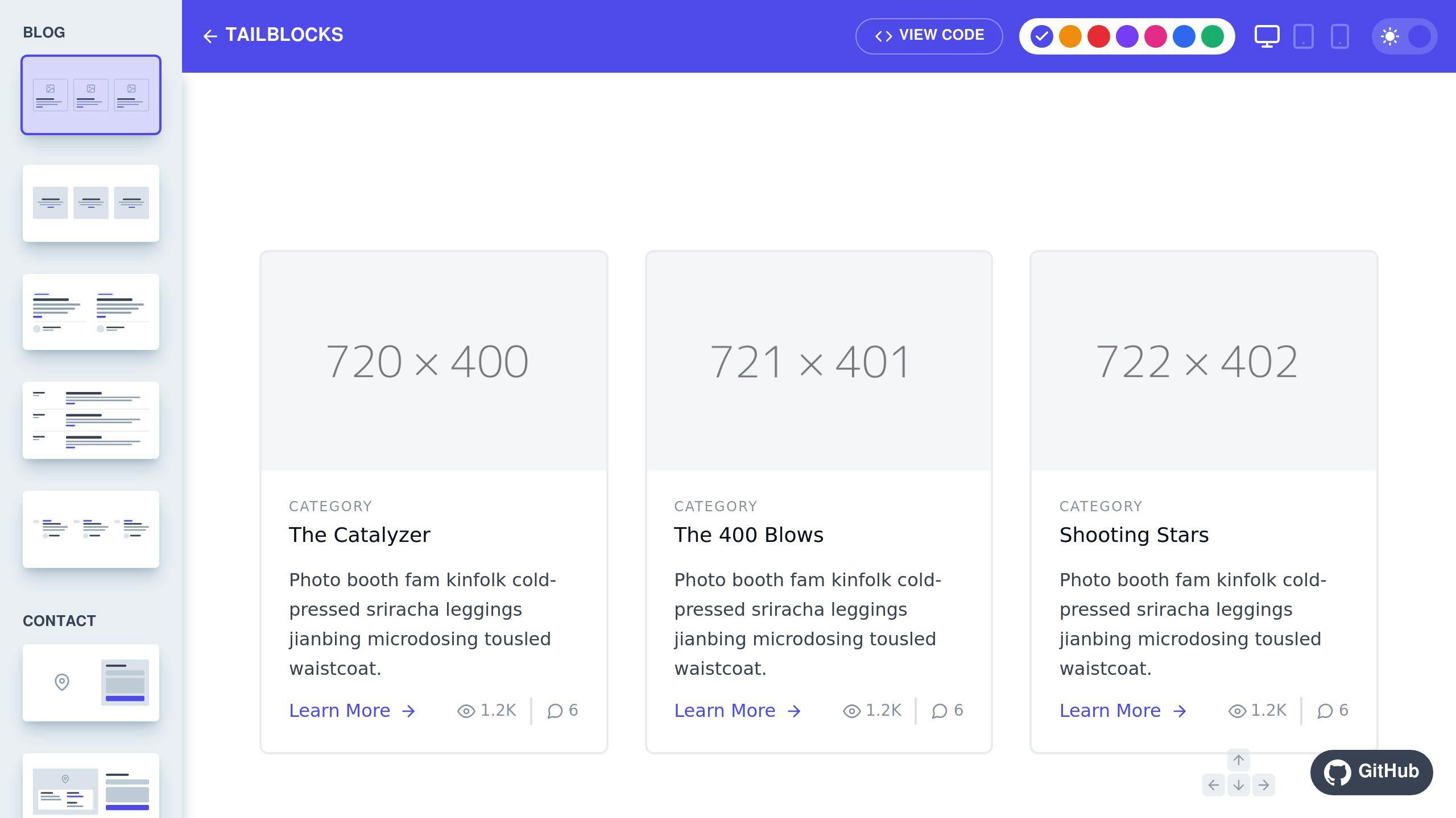
Tailblocks is a free, open-source library of Tailwind CSS components. It's like a box of LEGO for web developers - you get pre-built pieces to snap together and create responsive websites fast.
What's in the Box?
Tailblocks gives you 63 components in 15 categories. We're talking:
- Blog layouts
- Pricing sections
- E-commerce elements
Basically, it's got most of the common website parts covered. You can build pages quickly without starting from scratch.
Customization: The Good and the Meh
Here's the deal:
- Pro: Uses standard Tailwind CSS classes. You can tweak them if you know your stuff.
- Con: Fewer bells and whistles than paid libraries.
- Con: Out-of-the-box customization is limited.
How to Use It
It's pretty straightforward:
- Add Tailwind CSS to your project
- Go to the Tailblocks website
- Find a block you like
- Click "View Code"
- Copy-paste into your project
Even if you're new to Tailwind CSS, you can figure this out.
Support and Updates
Tailblocks is like that cool, free app you love - no customer service hotline, but it keeps getting better:
- Regular updates to stay in sync with Tailwind CSS
- Community discussions and contributions
If you're a developer on a budget, Tailblocks is a solid starting point. No subscriptions, no licenses - just grab it and go.
5. Tailgrids
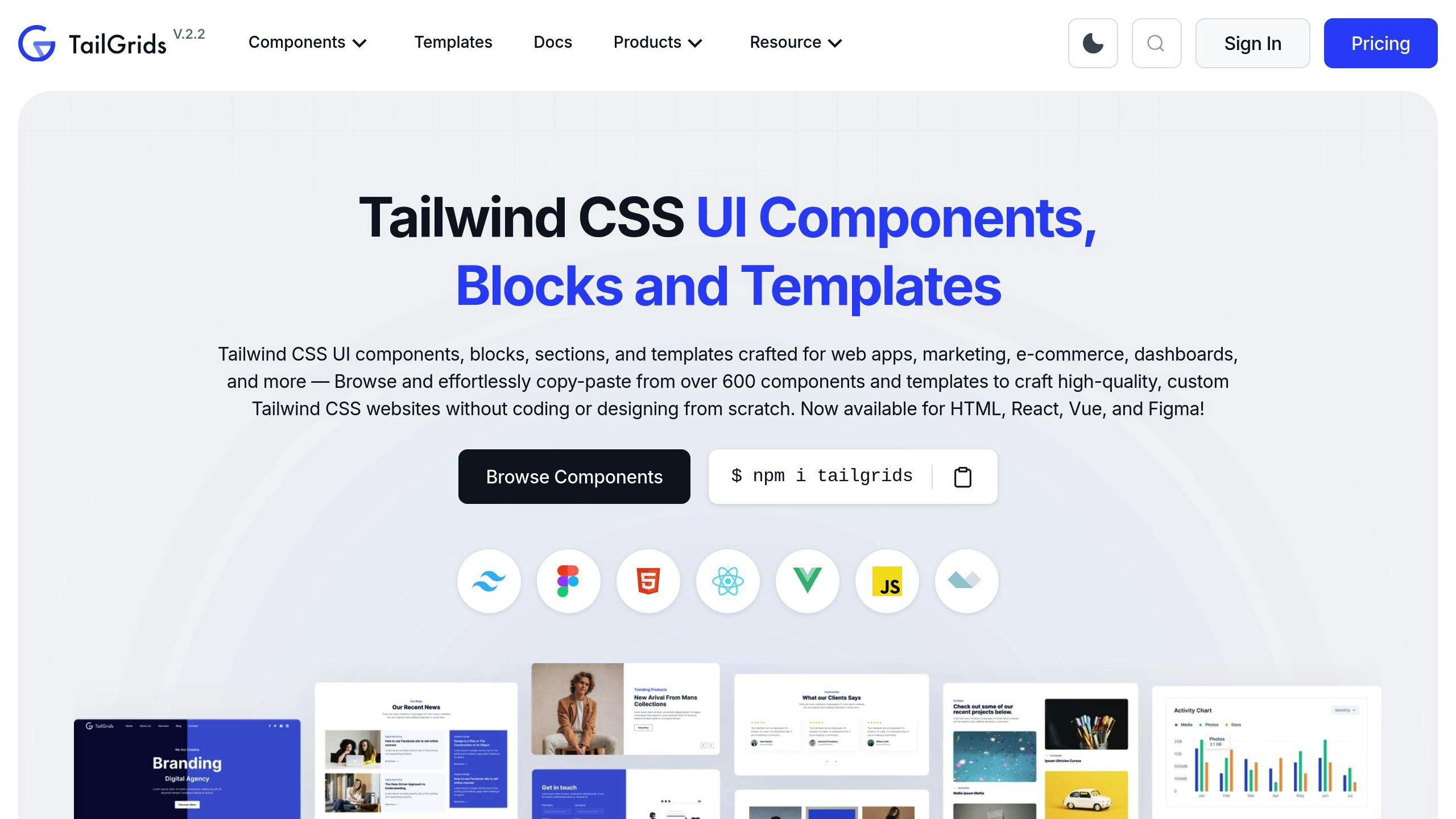
Tailgrids is a Tailwind CSS powerhouse. It's got over 600 UI components and templates for web apps, marketing sites, e-commerce, and dashboards.
Components
Tailgrids' library is HUGE:
- 500+ HTML components
- 100+ e-commerce elements
- 13 example templates
You'll find everything from basic buttons to complex layouts and AI components.
Customization
Tailgrids keeps it simple:
- Find a component
- Copy the code
- Paste into your project
- Tweak it
That's it. And it works with HTML, React, Vue, and Figma. It's like a dev Swiss Army knife.
Documentation
Need help? Check out tailgrids.com/docs. You'll find:
- How to install
- Using components
- Customization tricks
They updated it on August 4, 2024. So it's fresh.
User Support
Stuck? Tailgrids has your back:
- Discord chat
- Support tickets
They're quick, but don't promise specific response times.
Tailgrids isn't perfect. It's missing React and Vue versions of its components. But for HTML projects? It's a time-saver.
"TailGrids has all the UI components you need for Tailwind CSS websites. It's organized, easy to use, and has great design consistency." - Marko Denic, Developer Advocate and Software Engineer.
sbb-itb-55aadfa
6. Preline UI

Preline UI is an open-source Tailwind CSS component library with over 250 components. It's built to speed up your web development without limiting customization.
What's Inside?
- 60+ core components
- 171 pre-built sections
- Dark mode for all components
From basic buttons to complex layouts, Preline UI has you covered.
Making It Your Own
Customizing is easy:
- Pick a component
- Copy the code
- Paste into your project
- Tweak as needed
Built on Tailwind CSS, you can easily extend components using Tailwind's utility classes.
Getting Started
The docs are clear and user-friendly, covering:
- How to install
- Using components
- Customization tips
To start, run npm i preline and add it as a plugin in your tailwind.config.js. For form components, install the Tailwind CSS Forms plugin: npm install -D @tailwindcss/forms.
Need Help?
- Use GitHub Discussions for community support
- Check the docs at preline.co
While there's no direct support, the community and docs should solve most issues.
"Preline UI is a game-changer for UI development! As a fan of open source and efficiency, I'm thrilled with what Preline UI offers." - Thabresh Syed, User
Preline UI shines with its large component library and ease of use. It's perfect for quickly building responsive, mobile-first sites without starting from scratch.
7. Ripple UI
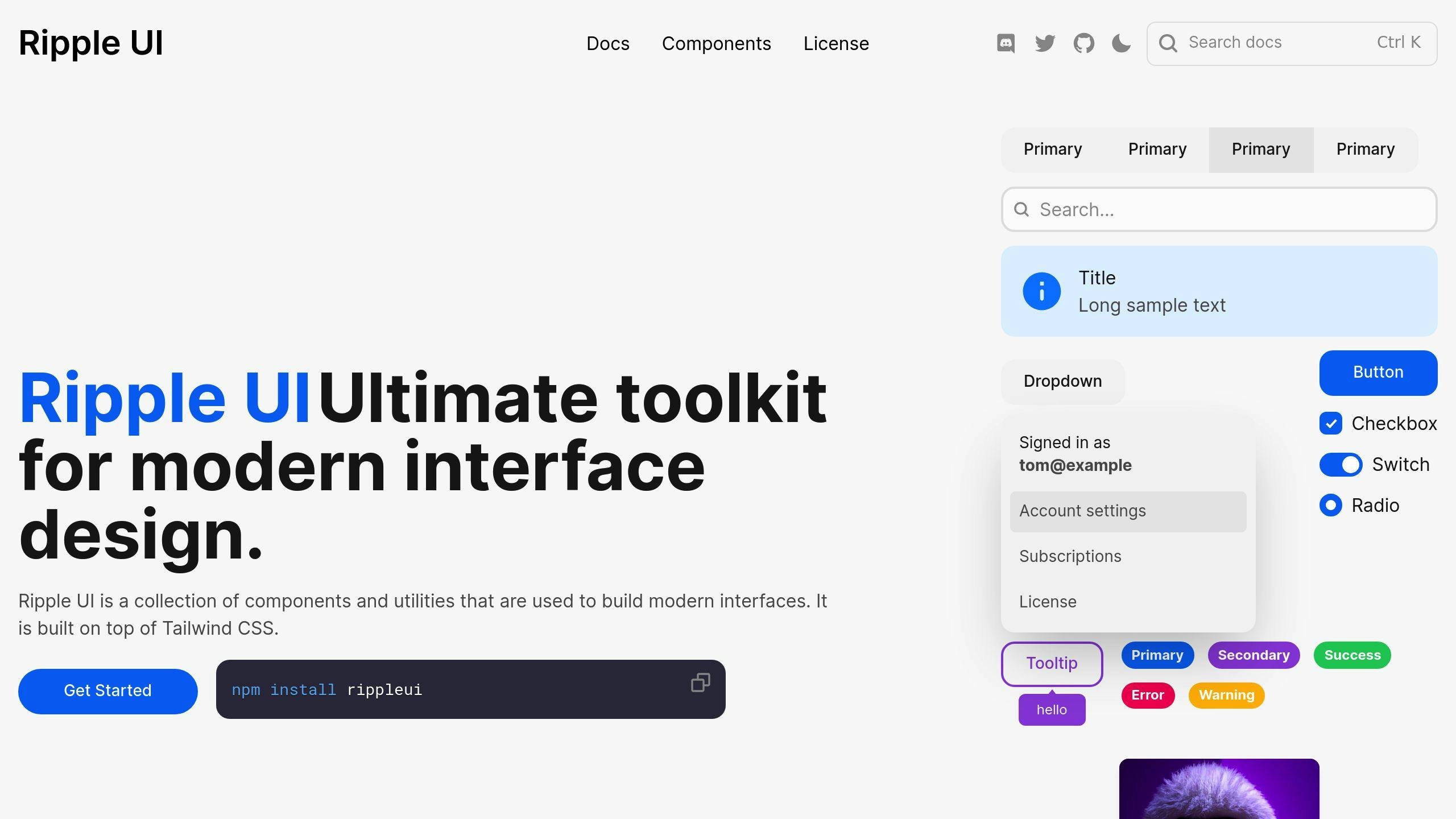
Ripple UI is a Tailwind CSS component library packed with pre-built elements. Here's what you need to know:
Components
Ripple UI offers a bunch of components:
- Buttons
- Checkboxes
- Modals
- Badges
- Dropdowns
- Avatars
- Navbars
- Cards
- Tables
They've been adding new stuff with each update.
Customization
Want to use Ripple UI? It's easy:
- Choose a component
- Copy the code
- Paste it into your project
- Tweak it with Tailwind CSS classes
Here's a simple button example:
<button class="btn btn-primary">Click me</button>
Documentation
The docs cover everything you need:
- How to install
- Using components
- Customization tips
- Theme setup
They keep the changelog up-to-date too.
User Support
No direct support, but you can:
- Check the docs
- Look for community discussions on GitHub
Ripple UI is great for quickly building responsive, mobile-first sites. Its focus on customization and regular updates make it a solid choice for developers.
8. Sira
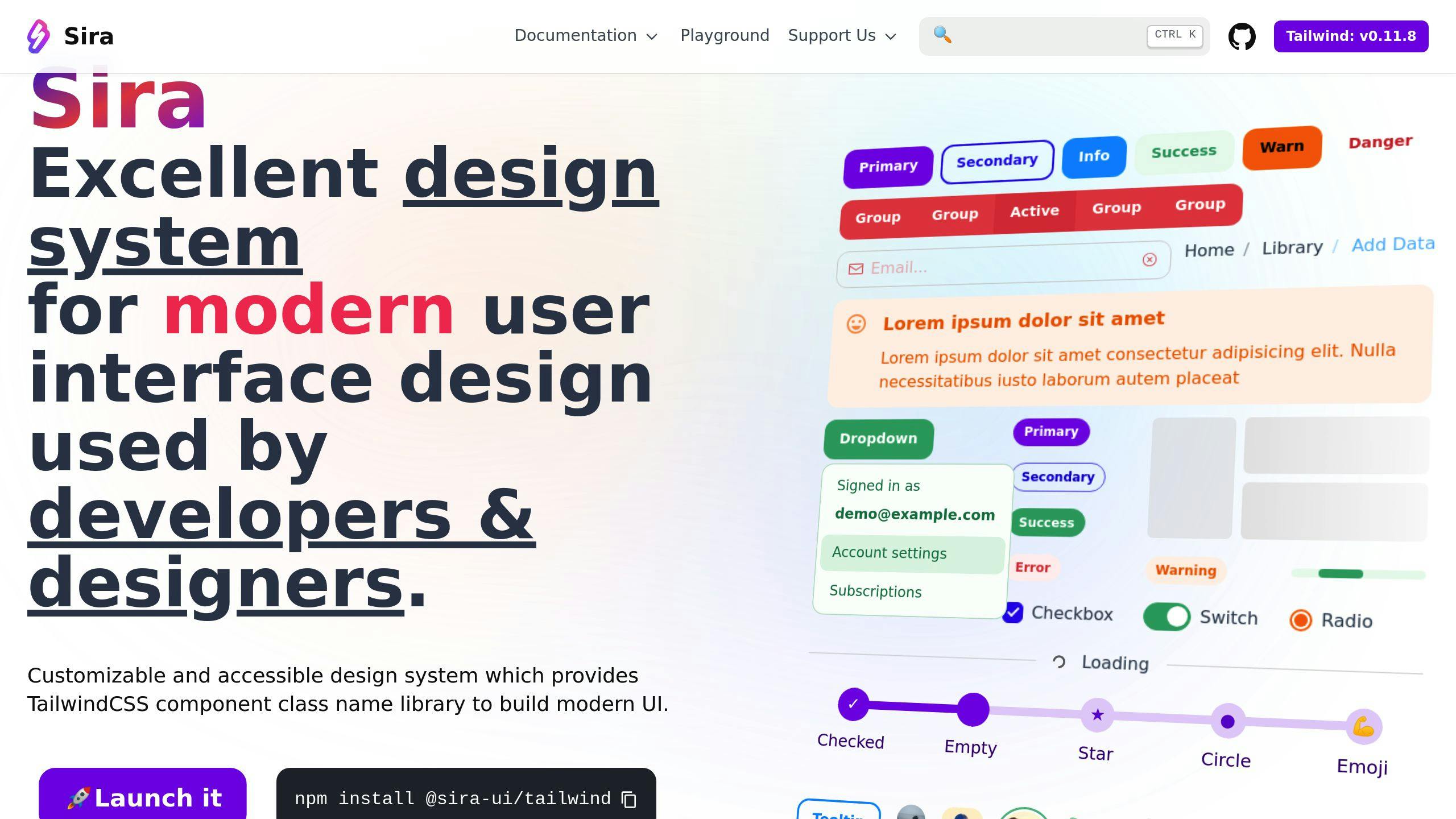
Sira is an open-source Tailwind CSS component library that packs a punch with customization and accessibility. Here's what you need to know:
What's in the Box?
Sira comes with 24 pre-built components. We're talking buttons, forms, modals, nav bars, cards - the works. And guess what? They play nice with React and Vue.
Make It Your Own
Sira's not just a pretty face. It's flexible:
- Light and dark modes? Check.
- Want to match your brand? Easy peasy.
- Need to tweak styles? Use CSS variables.
Getting started is a breeze:
npm install @sira-ui/tailwind
Read All About It
Sira's docs cover everything from installation to customization. They keep it fresh with each new release.
Need a Hand?
While there's no direct support, you're not alone:
- Hit up the GitHub repo for issues and chats
- Dive into the docs for troubleshooting
- Feel like contributing? Go for it! It's open-source.
Sira's your go-to if you want a full component set with a modern vibe. Its accessibility focus and customization options make it a solid choice in the Tailwind CSS world.
9. Mamba UI

Mamba UI is a free, open-source Tailwind CSS component library. It's packed with features:
Components
157 components across 41 categories. From buttons to weather widgets, Mamba UI's got you covered:
- Basic elements (avatars, buttons, inputs)
- Layout components (headers, footers, sidebars)
- Interactive elements (modals, carousels, tabs)
- Content display (cards, galleries, timelines)
Grab components as HTML or JSX. Easy integration? Check.
Customization
Mamba UI is flexible:
- 17 Tailwind colors for your primary palette
- Light and dark mode support
- Works with HTML, React, and Vue
Pro tip: Check Mamba UI's sample Tailwind config for smooth color integration.
Documentation
Everything's on the Mamba UI website:
- View code (HTML, Vue, or React)
- Copy-paste functionality
- Live preview
Find what you need, implement it. Simple.
User Support
Community-driven support:
- GitHub: 128 stars, 10 forks
- 6 open issues on GitHub
- Support options: Buy the creator a coffee or contribute code
Mamba UI? A solid pick for modern, versatile components. Free and paid options, multiple framework support. It's a developer's dream.
10. Kutty
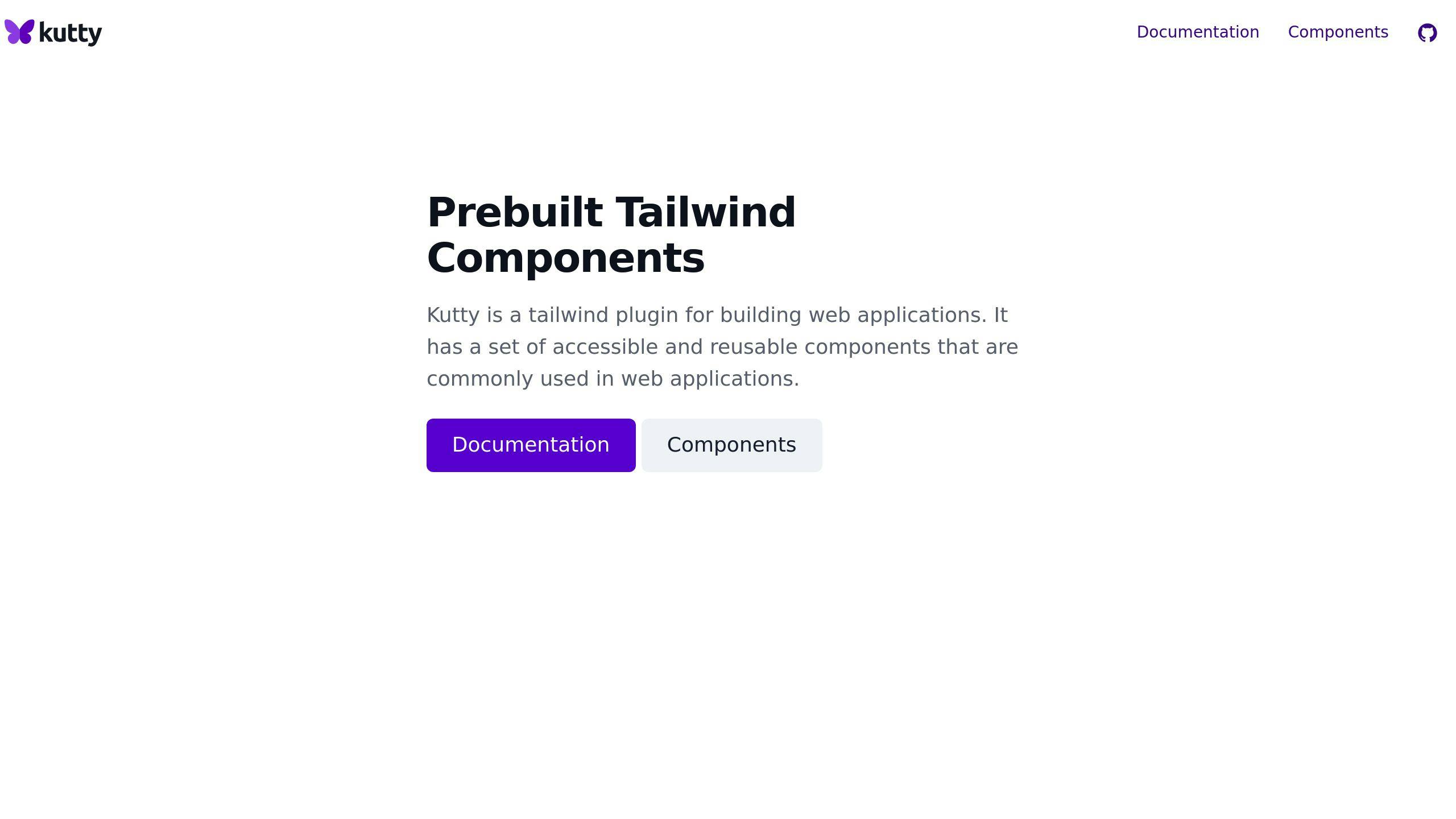
Kutty is a Tailwind CSS plugin that speeds up web app development. It offers ready-to-use components that are accessible and reusable.
What's in the Box?
Kutty comes with 66 pre-built UI sections. Here's a taste:
- Login and registration pages
- Error pages (404 & 500)
- Sidebar layouts (dark and light)
- Marketing elements (blog lists, CTAs, pricing tables)
And the best part? All components are fully responsive.
Make It Your Own
Want to use Kutty with your existing Tailwind setup? No problem:
- Install the plugin
- Add it to your Tailwind config
- Include AlpineJS for interactivity
This way, you can use Kutty's components without messing up your custom styles.
How to Use It
Using Kutty is straightforward:
- Find a component you like
- Copy the code
- Paste it into your project
- Tweak as needed
Need more details? Check out their website for full documentation.
Community-Powered
Kutty is open-source, so it relies on community support. While we don't have exact user numbers, it's part of the Tailkits collection - a set of tools designed to make life easier for Tailwind developers.
In short, Kutty is great for quickly adding common UI elements to your Tailwind projects. It strikes a nice balance between pre-built components and customization options.
Comparison Table
We've put together a table comparing the top Tailwind CSS component libraries. It'll help you pick the right one for your project.
| Library | Components | GitHub Stars | Framework Support | Customization | Dark Mode | Best For |
|---|---|---|---|---|---|---|
| Tailwind Elements | 500+ | N/A | Angular, React, Solid, Svelte, Vue | High | Yes | Complex projects |
| Flowbite | 400+ | 7,669 | Alpine.js, Laravel, Vue.js | High | Yes | Versatile use |
| Tailwind UI | Varies | N/A | Any Tailwind-compatible | High | N/A | Professional projects |
| Tailblocks | 60+ | N/A | Any Tailwind-compatible | Limited | N/A | Quick prototypes |
| Preline UI | 300+ | 3,200 | React, Next.js, Svelte, Remix | High | Yes | Modern interfaces |
| Ripple UI | 36 | N/A | Angular, React, Svelte, Vue | High | Yes | Simple to intermediate projects |
| Sira | 24 | N/A | React, Vue | High | Yes | Custom, modern interfaces |
| Mamba UI | 150+ | 300 | Angular, React, Svelte, Vue | Moderate | Yes | Modern look and feel |
| Kutty | 21 | N/A | Any Tailwind-compatible | High | No | Standard components |
| Tailwind Starter Kit | 120+ | 5,000 | React, Vue, Angular | High | N/A | Various project types |
This table gives you a quick look at each library's strong points. Need tons of components for a big project? Tailwind Elements might be your go-to with its 500+ components. Working on a React project and want lots of customization? Check out Preline UI.
GitHub stars can show how popular a library is. Flowbite, with 7,669 stars, has a big fan base. But don't pick based on stars alone.
Think about which frameworks you're using. Libraries like Flowbite and Mamba UI work with multiple frameworks, giving you more options.
And don't forget about features like dark mode. If that's a must-have, look at libraries like Tailwind Elements, Flowbite, or Ripple UI.
Pick the library that fits your project needs, works with your tech stack, and gives you the customization options you want.
Wrap-up
Tailwind CSS component libraries are game-changers for web developers in 2024. They're not just speeding up development - they're reshaping how we build websites.
Here's a quick rundown of some top players:
| Library | Components | Sweet Spot |
|---|---|---|
| Tailwind Elements | 500+ | Big, complex projects |
| Flowbite | 400+ | Multi-framework use |
| Preline UI | 300+ | Slick, modern interfaces |
| Mamba UI | 150+ | Sleek, contemporary look |
Each library has its own superpower. Tailwind Elements is the heavyweight champ with the most components. Flowbite plays nice with different frameworks. Preline UI is your go-to for modern interfaces, while Mamba UI is all about that sleek aesthetic.
Choosing your library? Consider this:
- How many components do you actually need?
- What's your framework of choice?
- Is dark mode a must-have?
- How much do you want to tinker with the design?
Don't get starry-eyed over GitHub stats. Sure, Flowbite's 7,669 stars are impressive, but that doesn't make it the perfect fit for every project.
The trend in 2024? More framework support and dark mode options. Developers are demanding more, and libraries are stepping up.
These libraries aren't just time-savers. They're changing the game, making it a breeze to whip up good-looking, functional sites in no time.


