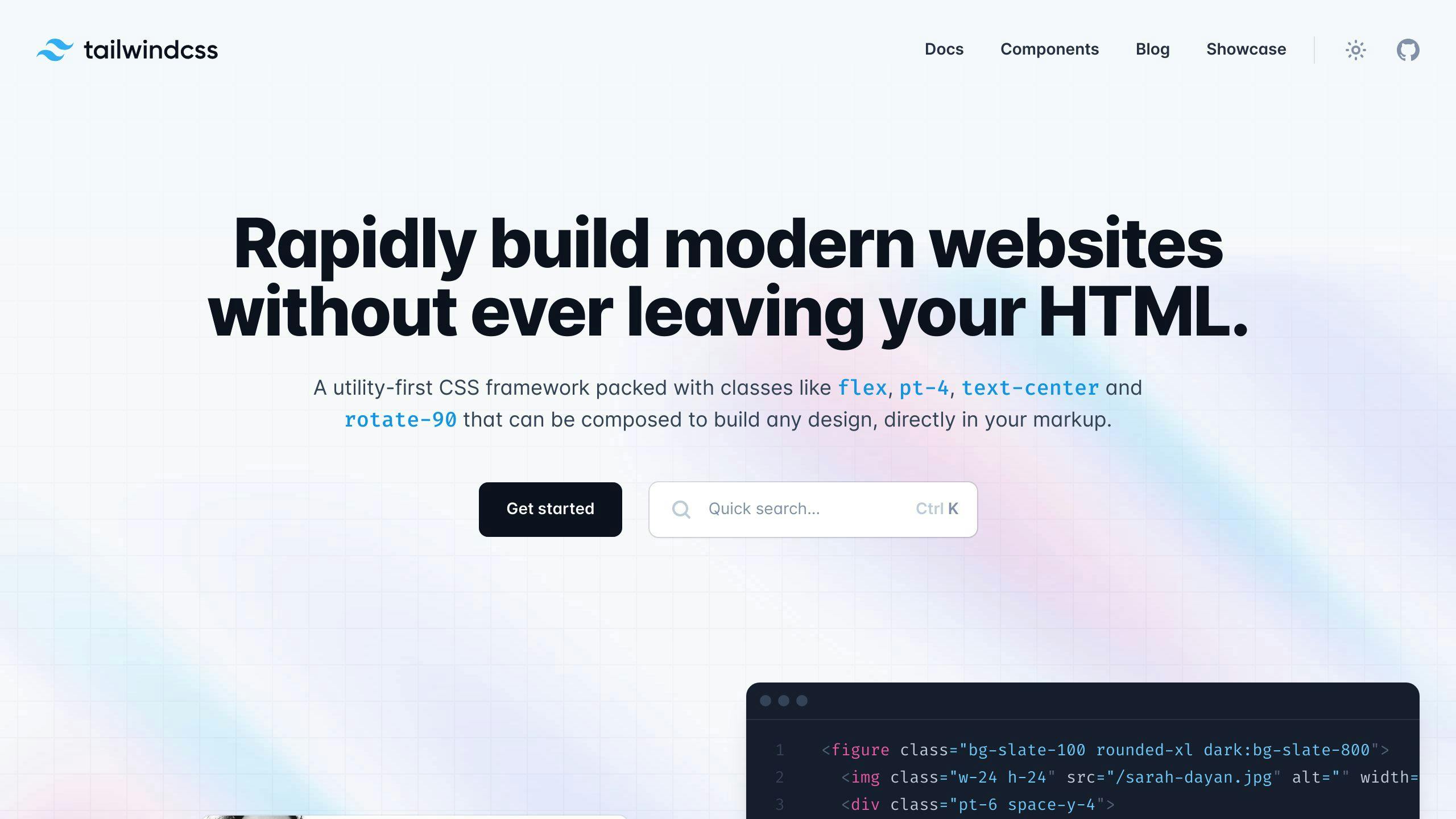
Tailwind CSS lets you easily customize your site's look and feel through its configuration file. Here's what you need to know:
- Config File:
tailwind.config.jsis your styling command center - Key Customizations:
- Colors
- Fonts
- Spacing
- Breakpoints
Related video from YouTube
Quick Setup
- Install Tailwind:
npm install -D tailwindcss postcss autoprefixer - Create config:
npx tailwindcss init - Edit
tailwind.config.js:
module.exports = {
  content: ["./src/**/*.{html,js}"],
  theme: {
    extend: {},
  },
  plugins: [],
}
Core Concepts
- Theme Section: Define your project's visual elements
- Extend: Add new styles without overwriting defaults
- Plugins: Inject new styles or modify core functionality
Tailwind vs Regular CSS
| Tailwind CSS | Regular CSS |
|---|---|
| Utility-first | Traditional stylesheets |
| Styles in HTML | Separate CSS files |
| Rapid development | More setup time |
| Consistent design | Potential inconsistencies |
Tailwind CSS streamlines web styling, letting you build unique designs faster and more consistently. Dive in and start customizing!
Basics of Tailwind CSS Configuration
Tailwind CSS customization revolves around tailwind.config.js. This file is your styling command center.
What's the config file?
tailwind.config.js is where you:
- Set colors
- Choose fonts
- Adjust spacing
- Define breakpoints
It's your project's style DNA, ensuring consistency across your site.
Finding the file
Look for tailwind.config.js in your project's root. No file? Create one:
npx tailwindcss init
Want the full default setup? Use:
npx tailwindcss init --full
File structure
Here's the basic tailwind.config.js structure:
module.exports = {
  content: [],
  theme: {
    extend: {},
  },
  plugins: [],
}
Breaking it down:
- content: Tells Tailwind where to look for class names.
- theme: Your style customization playground.
- plugins: Add extra features here.
The content section is key. Here's an example:
module.exports = {
  content: [
    './pages/**/*.{html,js}',
    './components/**/*.{html,js}',
  ],
  // ...
}
This scans HTML and JS files in pages and components directories.
Pro tip: Be specific with content patterns. Avoid broad ones like
'./**/*.{html,js}'. They can slow down your build.
Setting Up Tailwind CSS
Let's get Tailwind CSS up and running in your project. Here's how:
Install and Configure
First, install Tailwind and its friends:
npm install -D tailwindcss postcss autoprefixer
Now, create a config file:
npx tailwindcss init
This gives you a tailwind.config.js. Open it up and point it to your files:
module.exports = {
  content: ["./src/**/*.{html,js}"],
  theme: {
    extend: {},
  },
  plugins: [],
}
Link It Up
Create a CSS file (let's say src/input.css) with these lines:
@tailwind base;
@tailwind components;
@tailwind utilities;
Add this to your package.json:
"scripts": {
  "build": "tailwindcss -i ./src/input.css -o ./dist/output.css --watch"
}
Run it:
npm run build
Finally, add this to your HTML:
<link href="/dist/output.css" rel="stylesheet">
That's it! You're ready to start using Tailwind CSS.
Changing the Theme
Tailwind CSS lets you customize your project's look through the theme section in tailwind.config.js. Here's how:
Understanding the 'theme' section
The theme section is where you define colors, fonts, spacing, and more. It's a JavaScript object that controls your project's visual elements.
Changing existing theme values
To modify defaults, add custom styles to the theme object:
module.exports = {
  theme: {
    screens: {
      sm: '480px',
      md: '768px',
      lg: '976px',
      xl: '1440px',
      '2xl': '1760px',
    },
  },
}
This replaces Tailwind's default screen sizes.
Adding new values
To add new options, include them in the theme object:
module.exports = {
  theme: {
    colors: {
      'custom-blue': '#3252df',
    },
  },
}
Now you can use bg-custom-blue or text-custom-blue in your HTML.
Using 'extend'
The extend property adds new values without overwriting defaults:
module.exports = {
  theme: {
    extend: {
      spacing: {
        '72': '18rem',
        '84': '21rem',
        '96': '24rem',
      },
    },
  },
}
This keeps Tailwind's default spacing values while adding new ones.
Want to add a custom font? Here's how:
module.exports = {
  theme: {
    extend: {
      fontFamily: {
        'nunito': ['Nunito', 'sans-serif'],
      },
    },
  },
}
Now you can use font-nunito in your HTML.
After making changes, rebuild your CSS:
npx tailwindcss build styles.css -o styles/tailwind.css
Working with Colors
Tailwind CSS makes color management a breeze. Here's how to customize your palette and use it like a pro.
Changing the color palette
Want to add your own colors? Just edit tailwind.config.js:
module.exports = {
  theme: {
    extend: {
      colors: {
        'custom-green': '#609966',
      },
    },
  },
}
Now you can use bg-custom-green or text-custom-green in your HTML. Easy, right?
Making color variations
Tailwind uses a 50-900 scale for shades. Here's how to create your own:
module.exports = {
  theme: {
    extend: {
      colors: {
        'vivid-violet': {
          50: '#fcf5fe',
          // ... other shades ...
          900: '#66246b',
        },
      },
    },
  },
}
This gives you a full range of purple shades to play with.
Using custom colors
Once you've set up your colors, using them is simple:
<div class="bg-vivid-violet-100 p-8">
  <h1 class="text-2xl font-semibold text-vivid-violet-600">Hello</h1>
  <h2 class="text-3xl font-bold text-vivid-violet-800 mt-4">Welcome!</h2>
</div>
Don't forget to rebuild your CSS after making changes:
npx tailwindcss build styles.css -o styles/tailwind.css
And that's it! You're now a Tailwind color wizard.
sbb-itb-55aadfa
Customizing Typography
Typography can make or break your site's design. Tailwind CSS makes it a breeze to tweak fonts, sizes, and styles. Here's how:
Changing font families
Want a custom font? Here's the process:
1. Pick your font (let's say Roboto from Google Fonts)
2. Add this to your HTML:
<link href="https://fonts.googleapis.com/css2?family=Roboto:wght@400;700&display=swap" rel="stylesheet">
3. Update tailwind.config.js:
module.exports = {
  theme: {
    extend: {
      fontFamily: {
        roboto: ['Roboto', 'sans-serif'],
      },
    },
  },
}
4. Use it:
<h1 class="font-roboto text-3xl">Welcome!</h1>
Text sizes and line spacing
Tailwind's got preset sizes and line heights:
| Class | Font Size | Line Height |
|---|---|---|
| text-xs | 0.75rem | 1rem |
| text-sm | 0.875rem | 1.25rem |
| text-base | 1rem | 1.5rem |
| text-lg | 1.125rem | 1.75rem |
| text-xl | 1.25rem | 1.75rem |
For line spacing, try leading- classes:
<p class="text-lg leading-relaxed">Relaxed line spacing here.</p>
Custom text styles
Combine Tailwind classes for reusable styles:
<p class="text-lg font-semibold text-gray-800 tracking-wide">
  Custom style, anyone?
</p>
For complex styles, use @apply in your CSS:
.custom-heading {
  @apply text-2xl font-bold text-blue-600 mb-4;
}
Then use it:
<h2 class="custom-heading">Cool Section</h2>
Adjusting Spacing and Sizing
Tailwind CSS makes tweaking your layout's spacing and sizing a breeze. Here's how:
Changing the spacing scale
Want to add custom values to Tailwind's spacing scale? Just update your tailwind.config.js:
module.exports = {
  theme: {
    extend: {
      spacing: {
        '13': '3.25rem',
        '15': '3.75rem',
        '128': '32rem',
        '144': '36rem',
      },
    },
  },
};
Now you can use p-13 or m-15 in your HTML.
Custom widths and heights
Tailwind offers w- and h- classes for widths and heights:
| Class | Size |
|---|---|
| w-1 / h-1 | 0.25rem (4px) |
| w-2 / h-2 | 0.5rem (8px) |
| w-4 / h-4 | 1rem (16px) |
| w-full / h-full | 100% |
| w-screen | 100vw |
For a fixed-size element:
<div class="w-64 h-32 bg-gray-200">Fixed size box</div>
For responsive sizing:
<div class="min-w-full max-w-xl h-48 bg-gray-300">Responsive width, fixed height</div>
Responsive designs
Tailwind's responsive system uses breakpoints:
| Breakpoint | Min-width |
|---|---|
| sm | 640px |
| md | 768px |
| lg | 1024px |
| xl | 1280px |
| 2xl | 1536px |
Use {breakpoint}:{class} for responsive styles:
<div class="w-full md:w-1/2 lg:w-1/3">
  Full-width on mobile, half on tablets, one-third on desktops.
</div>
Customize breakpoints in tailwind.config.js:
module.exports = {
  theme: {
    screens: {
      'tablet': '640px',
      'laptop': '1024px',
      'desktop': '1280px',
    },
  },
};
Tailwind uses a mobile-first approach. Styles without prefixes apply to all screens, while prefixed ones apply from that breakpoint up.
Customizing Breakpoints
Want to tweak Tailwind's breakpoints? Here's how:
Change Default Breakpoints
Open your tailwind.config.js file and modify the screens object:
module.exports = {
  theme: {
    screens: {
      'sm': '576px',
      'md': '960px',
      'lg': '1440px',
    },
  }
}
Now md:text-center kicks in at 960px instead of 768px.
Add New Screen Sizes
Use the extend key to add breakpoints without messing with existing ones:
module.exports = {
  theme: {
    extend: {
      screens: {
        '3xl': '1600px',
      },
    },
  }
}
This adds a 3xl breakpoint at 1600px.
Use Custom Breakpoints
Here's how to use your new breakpoints in HTML:
<div class="w-full md:w-1/2 lg:w-1/3 3xl:w-1/4">
  Responsive div
</div>
This div changes width at different screen sizes.
Remember: Tailwind is mobile-first. Unprefixed styles apply to all screens, prefixed ones kick in at that breakpoint and up.
Using Plugins
Tailwind CSS plugins are JavaScript functions that add new styles to your project. They're a powerful way to extend Tailwind without writing custom CSS.
What are Tailwind CSS plugins?
Plugins inject new styles into your Tailwind stylesheet. They can add utilities, components, or even change Tailwind's core functionality.
Using third-party plugins
To use a third-party plugin:
- Install via npm
- Add to
tailwind.config.js
Example: Adding the Typography plugin
npm install @tailwindcss/typography
In tailwind.config.js:
module.exports = {
  plugins: [
    require('@tailwindcss/typography'),
    // other plugins...
  ],
}
This adds prose classes for text styling:
<article class="prose lg:prose-xl">
  <h1>Article Title</h1>
  <p>Content here...</p>
</article>
Making your own plugins
To create a custom plugin:
- Import
pluginfrom Tailwind - Define styles with JavaScript
- Add to config file
Example: Adding new utility classes
const plugin = require('tailwindcss/plugin')

module.exports = {
  plugins: [
    plugin(function({ addUtilities }) {
      const newUtilities = {
        '.skew-10deg': { transform: 'skewY(-10deg)' },
        '.skew-15deg': { transform: 'skewY(-15deg)' },
      }
      addUtilities(newUtilities)
    })
  ]
}
This creates skew-10deg and skew-15deg classes.
For more complex plugins, use addComponents:
plugin(function({ addComponents }) {
  const buttons = {
    '.btn': {
      padding: '.5rem 1rem',
      borderRadius: '.25rem',
      fontWeight: '600',
    },
    '.btn-blue': {
      backgroundColor: '#3490dc',
      color: '#fff',
      '&:hover': {
        backgroundColor: '#2779bd'
      },
    },
  }
  addComponents(buttons)
})
This adds .btn and .btn-blue classes.
Plugins are a flexible way to extend Tailwind, whether you're using third-party options or creating custom solutions.
Advanced Configuration Tips
Tailwind CSS lets you fine-tune your setup. Here's how to level up your config:
Using JavaScript in configuration
JavaScript in your Tailwind config file? Yep, it's a thing:
const primaryColor = '#4dc0b5';

module.exports = {
  theme: {
    extend: {
      colors: {
        primary: primaryColor,
        secondary: ({ opacities }) => ({
          DEFAULT: `rgb(79 70 229 / ${opacities.DEFAULT})`,
          hover: `rgb(79 70 229 / ${opacities.hover})`,
        }),
      },
    },
  },
};
This lets you use variables, generate styles programmatically, and create theme variations based on conditions.
Linking theme values
Want consistency? Reference other theme settings in your config:
module.exports = {
  theme: {
    extend: {
      colors: {
        primary: '#3252df',
        secondary: '#63727D',
      },
      backgroundColor: ({ theme }) => ({
        ...theme('colors'),
        highlight: theme('colors.primary'),
      }),
    },
  },
};
Now your highlight background color always matches your primary color.
Environment-based configurations
Different setups for different environments? No problem:
const isProd = process.env.NODE_ENV === 'production';

module.exports = {
  purge: isProd ? ['./src/**/*.html', './src/**/*.js'] : [],
  theme: {
    extend: {
      fontSize: isProd ? {
        sm: '0.8rem',
        base: '1rem',
        xl: '1.25rem',
      } : {
        sm: '0.9rem',
        base: '1.1rem',
        xl: '1.35rem',
      },
    },
  },
};
This uses smaller font sizes in production for better performance, but keeps things readable during development.
Improving Your Configuration
Let's make your Tailwind CSS setup leaner and meaner. Here's how:
Trim the Fat
Tailwind's default setup is huge. But you probably don't need all those classes. Here's how to slim it down:
1. Use the purge option in tailwind.config.js:
module.exports = {
  purge: ['./src/**/*.html', './src/**/*.js'],
  // other config options
}
2. Set NODE_ENV to production before building:
NODE_ENV=production npx tailwindcss -o styles.css
This can shrink your CSS file BIG TIME. Netflix's "Top 10" site? Just 6.5kB of CSS. That's tiny.
Streamline Your Config File
Keep your tailwind.config.js simple:
1. Group related stuff:
module.exports = {
  theme: {
    colors: {
      primary: '#3252df',
      secondary: '#63727D',
    },
    spacing: {
      sm: '0.5rem',
      md: '1rem',
      lg: '1.5rem',
    },
  },
}
2. Use extend to add or tweak styles:
module.exports = {
  theme: {
    extend: {
      colors: {
        'custom-blue': '#1da1f2',
      },
    },
  },
}
Keep It Clean
- Use fewer classes:
py-4beatspt-4 pb-4. - Be consistent: Use Prettier's Tailwind plugin.
- Make components: Don't repeat long class strings.
- Use
@apply: It's a lifesaver:
.btn-primary {
  @apply py-2 px-4 bg-blue-500 text-white font-semibold rounded-lg shadow-md hover:bg-blue-700 focus:outline-none focus:ring-2 focus:ring-blue-400 focus:ring-opacity-75;
}
- Go JIT: Use Tailwind's Just-in-Time engine (v3.0+) to generate only what you need.
Fixing Common Problems
Tailwind CSS can be tricky. Here's how to fix some common issues:
Configuration conflicts
Configuration conflicts? Check these:
1. Look at your tailwind.config.js file
2. Make sure your utility classes are in the right order
3. Use extend to add custom stuff without messing up defaults
Here's an example:
module.exports = {
  theme: {
    extend: {
      colors: {
        'custom-blue': '#1da1f2',
      },
    },
  },
}
Custom styles not working?
Try this:
1. Double-check the content key in tailwind.config.js
2. Look for typos in class names
3. Is your build process running?
Here's what a typical content config looks like for Next.js:
content: [
  "./app/**/*.{js,ts,jsx,tsx,mdx}",
  "./pages/**/*.{js,ts,jsx,tsx,mdx}",
  "./components/**/*.{js,ts,jsx,tsx,mdx}",
  "./src/**/*.{js,ts,jsx,tsx,mdx}",
],
Version differences
Keep your Tailwind setup working across versions:
1. Check for outdated packages:
npm outdated
2. Update Tailwind and friends:
npm update tailwindcss postcss autoprefixer
3. Clear your cache:
npm cache clean --force
npm cache verify
4. Still having issues? Try a clean install:
rd /s /q node_modules && npm install
Conclusion
Tailwind CSS lets you customize your site's look. Here's how:
- Change colors
- Adjust fonts
- Tweak spacing
- Set breakpoints
Play around. See what fits your project.
"Use Tailwind right, and your team will love the benefits." - Evil Martians
To get the most from Tailwind:
1. Have a design system
2. Use components
3. Limit utility classes
4. Set team code rules
5. Use linters
Don't forget: Optimize your CSS. Cut unused styles. Minify your code.
Tailwind isn't just a tool. It's a way to build sites faster and better. Master it, and you'll unlock new design options.
So open that tailwind.config.js file. Start creating something cool!
FAQs
How to configure Tailwind config file?
Setting up your Tailwind config file is easy:
- Open your terminal
- Go to your project's root
- Run this:
npx tailwindcss init
That's it! You've got a basic tailwind.config.js file.
Want all the default settings? Use:
npx tailwindcss init --full
Pro tip: Only change what you need. Tailwind's got your back with defaults for everything else.
What is a Tailwind theme?
Think of the theme section in tailwind.config.js as your project's style guide. It's where you set:
- Colors
- Fonts
- Text sizes
- Breakpoints
- Border radius
Here's a quick example:
module.exports = {
  theme: {
    colors: {
      blue: '#1fb6ff',
      purple: '#7e5bef',
      pink: '#ff49db',
    },
    fontFamily: {
      sans: ['Graphik', 'sans-serif'],
      serif: ['Merriweather', 'serif'],
    },
    extend: {
      spacing: {
        '128': '32rem',
        '144': '36rem',
      },
      borderRadius: {
        '4xl': '2rem',
      }
    }
  }
}
How do you override the default theme in Tailwind?
Want to change Tailwind's defaults? Here's how:
- Open
tailwind.config.js - Add a
themesection - Put in the key you want to change
Let's say you want Arial as your sans-serif font:
module.exports = {
  theme: {
    fontFamily: {
      'sans': ['Arial', 'sans-serif'],
    }
  }
}
Boom! Arial is now your default sans-serif font.
Need to add stuff without messing with defaults? Use extend:
module.exports = {
  theme: {
    extend: {
      colors: {
        'custom-blue': '#1fb6ff',
      }
    }
  }
}
This adds your custom blue while keeping all of Tailwind's default colors. Sweet, right?


